During the founding of America, tobacco was one of the most important cash crops that influenced early trade and mercantilism. Over the past few months, I have created visualization, written texts, and other projects about tobacco in the Mid-Atlantic region of America. Different forms of research and presentation can provide different insight and help contextualize history. My use of these methods help people understand this topic in an easy, concise, and efficient manner.
The first of these methods that I want to analyze is the timeline (Specific Timeline post linked here: https://danhuff.org/uncategorized/visualizations/). I used Knight Lab, a software that allows data to be put into a google sheet and creates an interactive timeline. This visualization is fairly easy to make, and the final product can be easily navigated. My timeline included important events about the founding of America as well as important events in the growth of tobacco trade. The largest takeaway from my timeline should be that the discovery of the Americas and trade across the Atlantic provided a platform for tobacco to be exported in large quantities to people all over the world. The interactive timeline (Figure 1) helps readers understand the chronology of these events as well as a short and concise description of the event and/or explanation of its significance. One of the events that supports my argument in this timeline is by 1630, Virginia alone was exporting 500,000 pounds of tobacco to England.
Line graphs are an effective way of demonstrating change over time. In figure 2, you can see the exports of tobacco from Virginia to New York over approximately a 10 year period. In this updated line graph, I added the exact number of packages that were exported that year. I created this line graph in R Studio, a programming software that is especially useful for statistical analysis. This graph is very concise and easy to understand, and conveys a story, despite the lack of words. From this visualization, users can see the fast growth of tobacco exports over a short period of time. Multiple conclusions can be drawn from this graph, such as (but not exclusive to): tobacco exports increased by over 50% from 1843 to 1844, or, tobacco exports increased an average of approximately 10,600 packages per year from 1840 to 1847. This graph can also spark discussion or further research, too, such as “Why was there a major decrease in tobacco exports from Virginia to New York from 1841 to 1842?”
A key part of understanding graphs is examining every aspect of the graph. The scale is one of the most important aspects of a graph and it is often overlooked. Scales can make the same data look as though it has changed drastically over time, or hardly changed at a/ll. Graphs also typically show a comparison between two variables, but it is important to think about possible confounding variables. Just because two variables are correlated, does not mean one causes the other! I dive further into this in my Visualizations blog, linked here: https://danhuff.org/uncategorized/visualizations/
A geographic information system (GIS) is a system that analyzes data to output a map visualization. Many people use GIS on a daily basis. Google Maps, along with other direction giving softwares, are one of the most common examples of this. ArcGIS is a software that allows users to create GIS and embed georectified maps. Georectified maps are maps that have been created and adjusted and overlaid to a current map. When creating my ArcGIS map, I found data of plantations in Virginia. I chose this because tobacco was a large cash crop in Virginia, and plantations are where tobacco is grown. I used a georectified map of the mid-atlantic region created in the 19th century. The combination of these two visualizations creates a visual of the plantations on the old map (Figure 3). On this map, there are a few things that are important to point out. As I said earlier with my timeline, being near a body of water in this region provided extremely good conditions for growing tobacco. Using the map, you can see how the plantations are condensely built along the Chesapeake Bay and other bodies of water.
The final method I am using to demonstrate the importance of tobacco in early America is my Airtable. Similar to excel and google sheets, Airtable is an online software that can be used to store datasets. Datasets are a collection of variables about a number of instances. These variables are stored in cells, and can hold numeric and alphabetical values. Different variables can be used to create different visualizations as well as groupings. My first table (Figure 4) shows the tobacco exports from Virginia to New York from different ports in 1847. The second table (Figure 5) shows all tobacco exports from Virginia to New York for different years. This is the data that was used in my line graph earlier. If there was more recorded data, I would have used both of these in the same table, creating a different instance for each port each year. However, the primary source I used did not have data for the individual ports outside of the year 1847. Airtable is one of the most effective ways of displaying a dataset when creating a historical narrative. It allows for readers to group, sort, and filter the data in a user-friendly manner. While a line graph better displays a visualization that can jump to conclusions faster, the use of a dataset can help readers get a full understanding, especially if data is excluded from the visualization. A link to my airtable can be found here: https://airtable.com/appLbtwquSeojHpnI/shrh75uB9441qPCmZ/tblYLzTcTuwWnIgPG/viwIVbXS8X2gwBfHv?blocks=hide
When creating a historical narrative, different methods and visualizations are essential to successfully convey the topic. Through the timeline, line graph, ArcGIS map, and Airtable, I am able to better explain the importance of tobacco in the mid-atlantic in early America. The different methods each provide their own advantages, from better geographical, chronological, or statistical explanations. While words may be able to tell the story, these methods contextualize it.
Bibliography
Burr, David H., Cartographer, David H Burr, and John Arrowsmith. Map of Virginia, Maryland and Delaware exhibiting the post offices, post roads, canals, rail roads &c. [London: J. Arrowsmith, 1839] Map. https://www.loc.gov/item/98688346/ (Accessed 4/23/2024).
Wikimedia Foundation. (2023, December 23). List of plantations in Virginia. Wikipedia. https://en.wikipedia.org/wiki/List_of_plantations_in_Virginia
Frick, George F. “The Reverend John Clayton: A Parson with a Scientific Mind.” OUP Academic, July 1, 1967. https://academic.oup.com/ahr/article-abstract/72/4/1481/105282?redirectedFrom=fulltext.
“History of Tobacco.” Wikipedia, April 6, 2024. https://en.wikipedia.org/wiki/History_of_tobacco.
“IMPORT OF VIRGINIA TOBACCO INTO NEW YORK.” The Merchants’ Magazine and Commercial Review, Volume 18, no. 2, (1848): 211. Proquest.
“John Rolfe.” Wikipedia, April 5, 2024. https://en.wikipedia.org/wiki/John_Rolfe.
King James I. “‘A Counterblaste to Tobacco’: James I and His Aversion to Smoking.” Worcester Cathedral Library and Archive Blog, October 13, 2014. https://worcestercathedrallibrary.wordpress.com/2014/10/13/a-counterblaste-to-tobacco-james-i-and-his-aversion-to-smoking/.
Salmon, Contributor: Emily Jones, and Contributor: John Salmon. “Tobacco in Colonial Virginia.” Encyclopedia Virginia, February 13, 2023. https://encyclopediavirginia.org/entries/tobacco-in-colonial-virginia/.
“Tobacco: The Early History of a New World Crop.” National Parks Service. Accessed April 4, 2024. https://www.nps.gov/jame/learn/historyculture/tobacco-the-early-history-of-a-new-world-crop.htm.
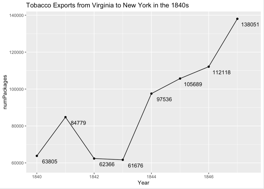
Fig. 2 – Tobacco Exports from Virginia to New York in the 1840s. The number located below and to the right of the point is the number of packages for that specific year.
Virginia Plantations
Fig. 3 – Using your mouse and the ‘+’ and ‘-’ icons in the top left, you can navigate throughout the map. The red wheat icons represent an individual plantation, and you can click on the icon for more information.
Tobacco Exports from Virginia to New York by Port (1847)
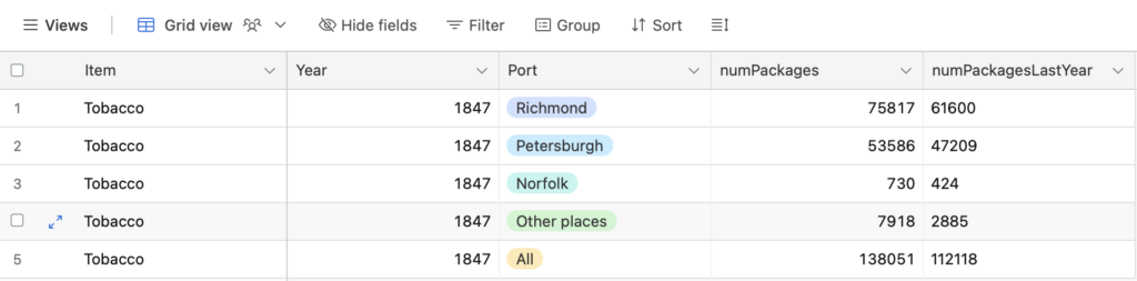
Fig. 4 – This table shows the exports of tobacco from Virginia to New York, separated by the port in which they were exported from. Richmond had the highest number of exports (75,817), followed by Peterburgh (53,586).
Tobacco Exports from Virginia to New York (1839-1847)
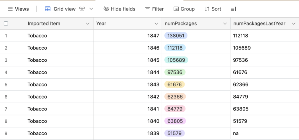
Fig. 5 – This table shows the exports of tobacco from Virginia to New York from every port, separated by the year. While there are some years where the number of exports decrease, you can see that there is a general positive trend over time of the number of exports. This can be better visualized in Figure 2.
Timeline of Tobacco in America
Fig. 1 – In this timeline, you will see events that catalyzed the rapid growth of tobacco, from the discovery of the Americas to the first inspections required on tobacco. Use the arrows to navigate between events that will explain the time and significance of the event.