Timeline
My timeline was about the relation of the early colonists’ discovery of America and its relation to the tobacco crop. The events on my timeline, although quite spread out and seemingly unrelated, were chosen carefully to get a full understanding of my topic. While Christopher Columbus was never alive to see the port of Jamestown, the trade of tobacco from Jamestown would not have happened without his expedition. The largest takeaway from my timeline should be that the discovery of the Americas and trade across the Atlantic provided a platform for tobacco to be exported in large quantities to people all over the world. (Fig. 2)
Bibliography
Frick, George F. “The Reverend John Clayton: A Parson with a Scientific Mind.” OUP Academic, July 1, 1967. https://academic.oup.com/ahr/article-abstract/72/4/1481/105282?redirectedFrom=fulltext.
“History of Tobacco.” Wikipedia, April 6, 2024. https://en.wikipedia.org/wiki/History_of_tobacco.
“John Rolfe.” Wikipedia, April 5, 2024. https://en.wikipedia.org/wiki/John_Rolfe.
King James I. “‘A Counterblaste to Tobacco’: James I and His Aversion to Smoking.” Worcester Cathedral Library and Archive Blog, October 13, 2014. https://worcestercathedrallibrary.wordpress.com/2014/10/13/a-counterblaste-to-tobacco-james-i-and-his-aversion-to-smoking/.
Salmon, Contributor: Emily Jones, and Contributor: John Salmon. “Tobacco in Colonial Virginia.” Encyclopedia Virginia, February 13, 2023. https://encyclopediavirginia.org/entries/tobacco-in-colonial-virginia/.
“Tobacco: The Early History of a New World Crop.” National Parks Service. Accessed April 4, 2024. https://www.nps.gov/jame/learn/historyculture/tobacco-the-early-history-of-a-new-world-crop.htm.
Data Visualization
My chart is a line graph that shows the tobacco exports into New York in the 1840s. I chose a line chart because it is good at showing the change of a quantitative value over time. The data shows the number of packages shipped annually for eight consecutive years. From this visualization, the biggest takeaway is the rapid growth of export. From 1843 to 1847, the exports nearly doubled, showing how fast the crop was growing in popularity. (Fig. 1)
Bibliography
“IMPORT OF VIRGINIA TOBACCO INTO NEW YORK.” The Merchants’ Magazine and Commercial Review, Volume 18, no. 2, (1848): 211. Proquest.
Reflection
A visualization is an expression of data using more understandable means. Good visualizations are able to convey a point made by the author efficiently and effectively. There are many different types of visualizations, including but not exclusive to lines charts, maps, and histograms. Different types of visualizations are better at conveying different types of data. For example, a line chart should not be used to show the populations of different towns, as each town has no relation to the next. A bar chart would better express this, as you could use it to show a discrepancy in populations for whatever argument the author is trying to make. Visualizations can be very misleading, though. Scales of charts can be linear, exponential, or logarithmic, which at first glance can go unnoticed. This can be used in an attempt to fearmonger, or the exact opposite. In addition to this, the sample/data used in visualizations is chosen by the author, who may choose to exclude data that contrasts their argument. The source, scale and argument made by the author should all be considered when looking at a visualization. Some questions you should ask yourself are: Where is this data coming from? Are any quantitative values being used on a scale that makes sense? What data isn’t being included? Are there any confounding variables that could explain this visualization? Visualizations can also be used to enhance historical articles. Visualizations can tell a story without any words, which can help consumers get a greater understanding of a subject, as well as intake the information more efficiently. My timeline helps users get a greater understanding of major historical events in early American history, as well as their relation to Tobacco. My chart is an example of how data can be visualized to tell a story in a fast and simple manner.
Figure 1
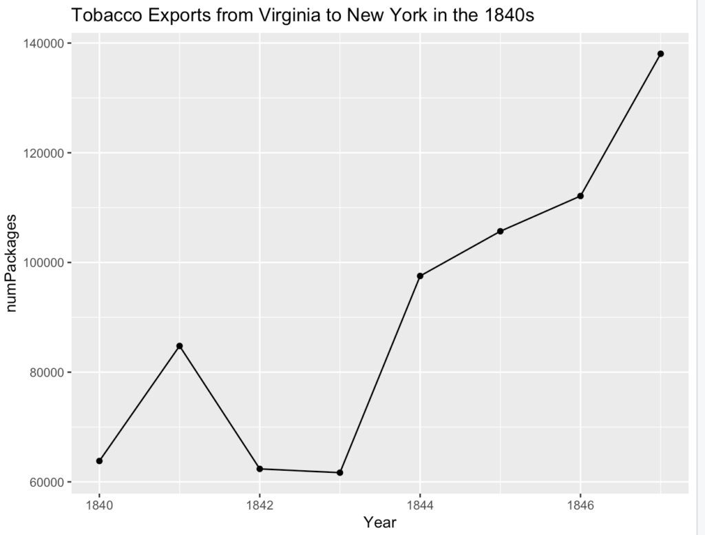
Figure 2